Visual Market Sector Analysis for Financial Time Series Data
Jan 11th, 2011 | By Prof. Dr. Daniel A. Keim | Category: Featured Articles, NewsThe massive amount of financial data that originates from the stock markets generates large amounts of complex financial time series data of high interest. In their VAST 2010 paper, Ziegler and colleagues from the University of Konstanz, Germany introduce two techniques and applications that support the analysis of large amounts of financial time series data in order to get insight into the development of assets, market sectors, countries, and the financial market as a whole.
The first technique allows to analyze multiple combinations of single assets, market sectors, and countries at the same time and to visually discover the periods of time where market sectors and countries get into turbulence. The second technique supports a sector-wise comparison of time series data which are automatically clustered by graphs that are representative for a sector, and identify the assets which behave differently than others assets in the same sector.
Both application work in real-time and support visual interactive exploration by the user.

Figure Caption:
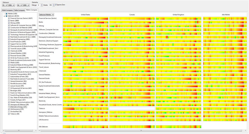
The figure shows the visual comparison of the development of all assets for 3 countries and 28 market sectors from 01/2006 and 04/2009.
The red bars that belong to the crash of the stock market in 2009 have affected most of the sectors, but a closer look shows that several sectors in some countries have not been affected by the crisis. From the starting point of the red bars it is possible to detect that the crisis did not start in all sectors at the same time, but one after the other, and that it initially started with the banks in the United States.