Making Hurricane Track Data Accessible
Sep 8th, 2010 | By Dr. Aidan Slingsby | Category: Featured Articles, NewsWe worked with climate scientists at NCAS-Climate (University of Reading, UK) who produce large datasets of simulated storm tracks from General Circulation Models that span many decade, and need to analyse them. We collaboratively designed and implemented interactive visualisation techniques that have opened up their database, enabling storm tracks to be browsed in their spatial and temporal context, and for specific examples to be captured as Quicktime video clips.
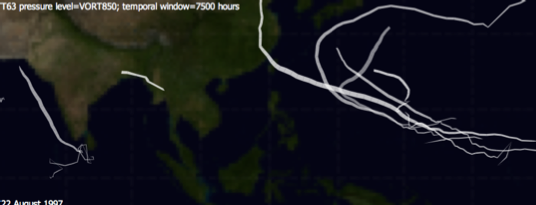
‘Sticky tracks’: tracks that follow similar paths within a short temporal window – strong implications for insurance.
The purpose of generating these storm tracks was to better understand the spatial and temporal distribution of storms, particularly for extreme events. These are being applied to the insurance industry through the Willis Research Network – the world’s largest collaboration between academia and the insurance industry – to improve understanding of the potential impacts of such events. Much of the current knowledge in this regard has been derived from the analysis of historical events. Limitations of historical climate data include the small sample size of events, particularly those that are extreme, and the limited time-scale for which data are available (50 years at most). General Circulation Models can now be run on supercomputers at a resolution at which information about individual storms can be resolved.
The climate scientists’ current approach to analysis requires them to identify a question to be investigated and then prepare the data in order to answer that question. This is not conducive to exploratory analysis. They wanted a means to browse the dataset without such a prior assumptions and to identify periods of activity that warranted further analysis, but did not know how interactive visualisation would help.
Our first attempt of visual analysis with this dataset was to characterise spatial and temporal patterns over different time-scales, an approach we often take. However, the users told us that they wanted to be able to isolate particular interesting examples of storm tracks in quite narrow temporal windows. We collaboratively designed an interface in order that decades of tracks data could be browsed quickly in order to identify short time periods in which the spatial arrangement of tracks was particularly typical or atypical.
There are number of reasons why this exploratory analysis was important. It helped the climate scientists identify apparently anomalous behaviour which either represented valid but rarely observed behaviour due to a particular set of atmospheric and oceanic conditions, or that the model needs certain parameters to be adjusted under certain conditions. This enables climate scientists to improve theirs model and to identify conditions which may have a significant impact in terms of monetary, property and/or human loss. The ability to capture video clips of these situations allows talks given to academic peers and representative at all levels in the insurance industry to be richly illustrates with specific examples that illustrate particular points made. The tool itself is cross-platform, lightweight and easy to use, making it easy to distribute and be adopted quickly by different user groups. There is also potential for the tool to be used in an education context.
Our tool displays the storm tracks on a world map. We used the Mercator projection because the users wanted the geometry of the paths to be preserved. Animation was used to play’ through time, within a narrow temporal window with tracks gradually fading as the temporal window moved over them. The size of the temporal window can be adjusted from just a few hours to entire seasons. Our solution to rapid browsing of the dataset was to have an implicit timeline at the bottom of the screen, scaled such that the start of the period for which data were available was on the left and the end of the period was on the right. Moving the mouse along the bottom of the screen displayed the tracks at the corresponding time. Pausing movement of the mouse allowed the tracks to ‘play’ at the normal animation speed and pressing a key on the keyboard starts and stop video capture.
This work was written is one of the entries at the IEEE VisWeek Discovery 2010 exhibition, which present examples of visualisation that has made a tangible impact. The entry (see below) contains details of the insights had and the impact it is having on climate science and the insurance industry.
The impacts include: the adoption of interactive visualisation by climate scientists, demonstrating the range of possibilities of storm track configurations to wide audiences, the identification and collation of video clips that illustrate important examples, communicating the fact that storm tracks tend to cluster in time and space (strong implications for insurance, but not fully appreciated).
This exercise illustrates the value of working closely with a user group. We were able to implement ideas quickly using Processing, enabling rapid feedback, redesign and turnaround, and were not constrained by some of the limitations of higher-level visualisations environments. The tool has evolved over a period of a few months, and we hope to continue developing it, adding new functionality (e.g. alternative map projections for different tasks, spatial filtering, displaying atmospheric and oceanic conditions) and evaluating the techniques with different user groups.
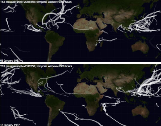
Comparing a La Nina year (top) with an El Nino year (bottom)
This work was carried out by Aidan Slingsby, Jason Dykes and Jo Wood (giCentre, City University London) with Jane Strachan and Pier-Luigi Vidale (NCAS-Climate, University of Reading).
Reference.
Slingsby, A., Strachan, J., Vidale, P-L, Dykes, J, and Wood, J. 2010. Discovery Exhibition: Making Hurricane Track Data Accessible. Discovery Exhibition Entry, 2010. View entry.