User testing to obtain consensus for discovering the terrorist
Jul 31st, 2010 | By Dr. Paolo Buono | Category: Featured Articles, NewsThe adoption of Visual Analytics methodologies in security applications is an approach that could lead to interesting results. Usually, the data that has to be analyzed finds in a graphical representation its preferred nature, such as spatial or temporal relationships. Due to the nature of these applications, it is very important that key-details are made easy to identify.
The simulation of natural or human-made disaster is a topic that has gained attention, especially after the 9/11 events. Johnson argues that the CHI communities should try to gain valuable insights from those events and try to address the unexpected challenges in hope of improving the effectiveness of emergency personnel and escape plans [2]. The study of escape plans is also an interesting direction for research: Andrienko et al [3] describes an automatic scheduling algorithm generator able to generate evacuation plans, subsequently analyzed by human operators in order to judge their feasibility. Kim et al [4], developed a tool dedicated to first responders, for the analysis and representation of sensor network data. Their system displays on a mobile device, both in 2D and in 3D, a graphical representation of the situation of people whereabouts in a building, complete with their supposed health level.
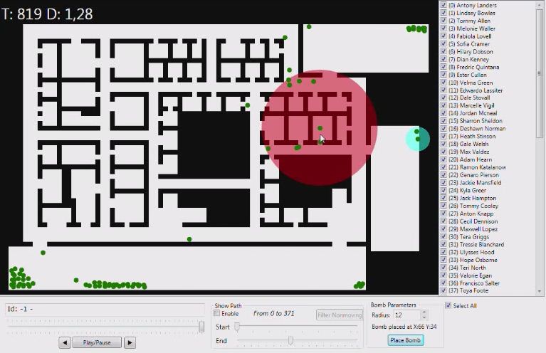
Figure 1. Map of the building after the bombing. The bomb is supposed to be placed in the red area
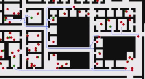
Figure 2. The movement traces of people are displayed for a specific time span.
All of the users (except one) repeatedly watched the animation and quickly concluded where the place of the detonation was, due to the fact that most of the employees that were present in that area, after the supposed explosion of the bomb, “stopped moving” (as most of the interviewed said). This observation made them more interested in the events that occurred in the red area marked in Figure 1. By looking more closely at that part of the animation they were able to identify a number of potential suspects and witnesses to the detonation.
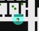
Figure 3. A useful feature is the ability of highlighting a person.
We then proceeded to ask them the same questions that are reported on the answer form. The results of this testing shows that 76,92% of the interviewed agree that Number 21 is the most probable suspect of having detonated the bomb. It is interesting that so high a percentage of the interviewed agrees on his guiltiness. We asked the reason and all the interviewed users said that “he moves from his room to a room with two occupants where he either throws the device inside the room or activates it before exiting his room; subsequently, he flees and hides on a corner wall before escaping the facility”. Some of the other users expressed their concern towards the behavior of Number 13 and 59. In fact, they suspected that number 59 tries to escape the building, then changes direction and returns inside towards another exit. Number 13 follows 59 and at some point 59 “stops moving”. Those users that noticed this suspicious behavior thought that 59 must have been a witness to the event and that s/he was killed by 13. They were not able to explain why because 59 does not seem to be very close to the zone of detonation, but since more than one person noticed it, it could become relevant. Detailed results are shown in Table 1.
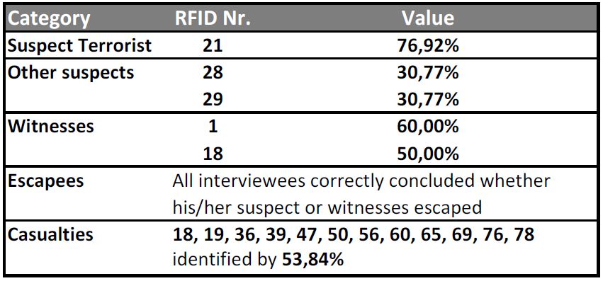
Table 1. Results of the interview
When asked to determine which ones amongst the employees could be witnesses to the event, the interviewed assumed that those who could be connected by an uninterrupted straight line to the suspect could have seen something. Since data about each person’s orientation was not available, by assuming that Nr. 21 is the most probable suspect, a witnesses is supposed to be everyone that has him in his/her “line of sight”, at some point during the animation. We observed, though, that the persons that we interviewed did not manage to identify all the potential witnesses (all those that “see” Nr. 21). We think that this is probably due to the fact that they spent more time on finding persons with a suspect behavior, rather than checking which of the other persons could have seen him.
 di
di unibait (buono
 diunibait) diunibait (simeonediunibait)
 [1] VAST 2008 Challenges:
http://www.cs.umd.edu/hcil/VASTchallenge08/tasks.html (Last Retrieved on June the 28th, 2010)
[2] C.W. Johnson, “Applying the lessons of the attack on the world trade center, 11th September 2001, to the design and use of interactive evacuation simulations,” Proceedings of the SIGCHI conference on Human factors in computing systems, Portland, Oregon, USA: ACM, 2005, 651-660;
[3] G. Andrienko, N. Andrienko, U. Bartling, “Visual analytics approach to user-controlled evacuation scheduling,” Information Visualization, vol. 7, 2008, 89-103.
[4] S. Y. Kim, Y. Jang, A. Mellema, D. S. Ebert, T. Collinss, “Visual Analytics on Mobile Devices for Emergency Response”, Visual Analytics Science and Technology, VAST 2007, 35-42.